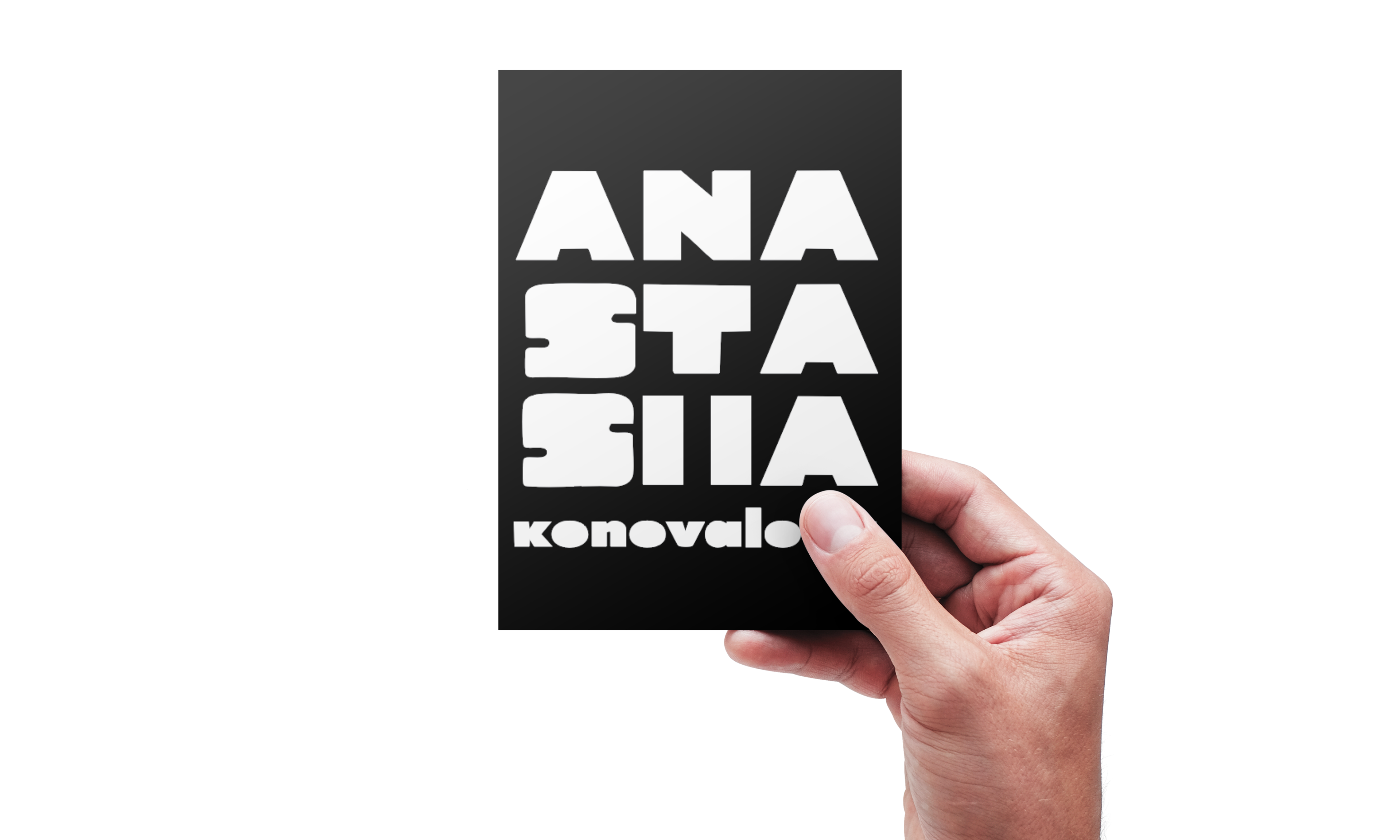
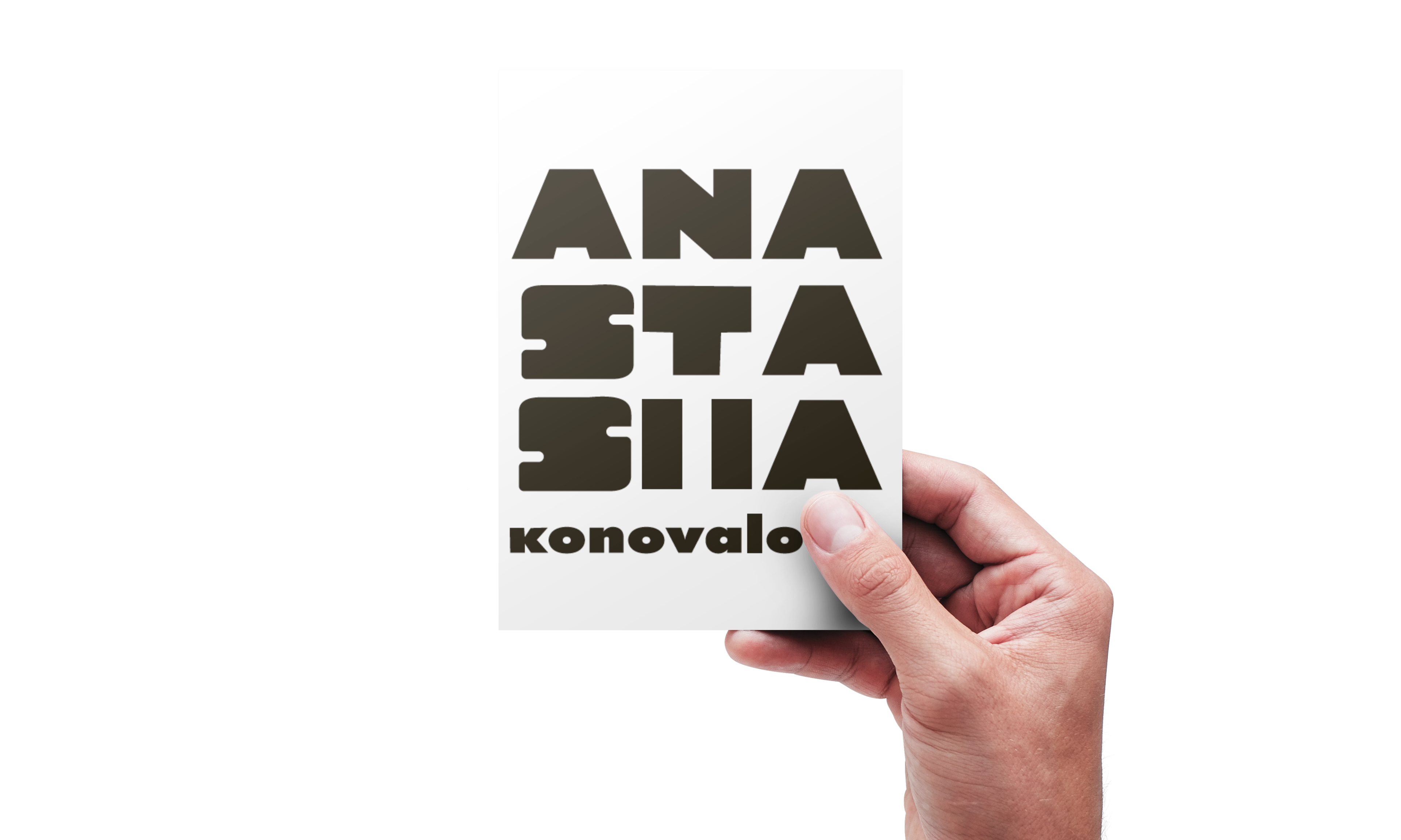
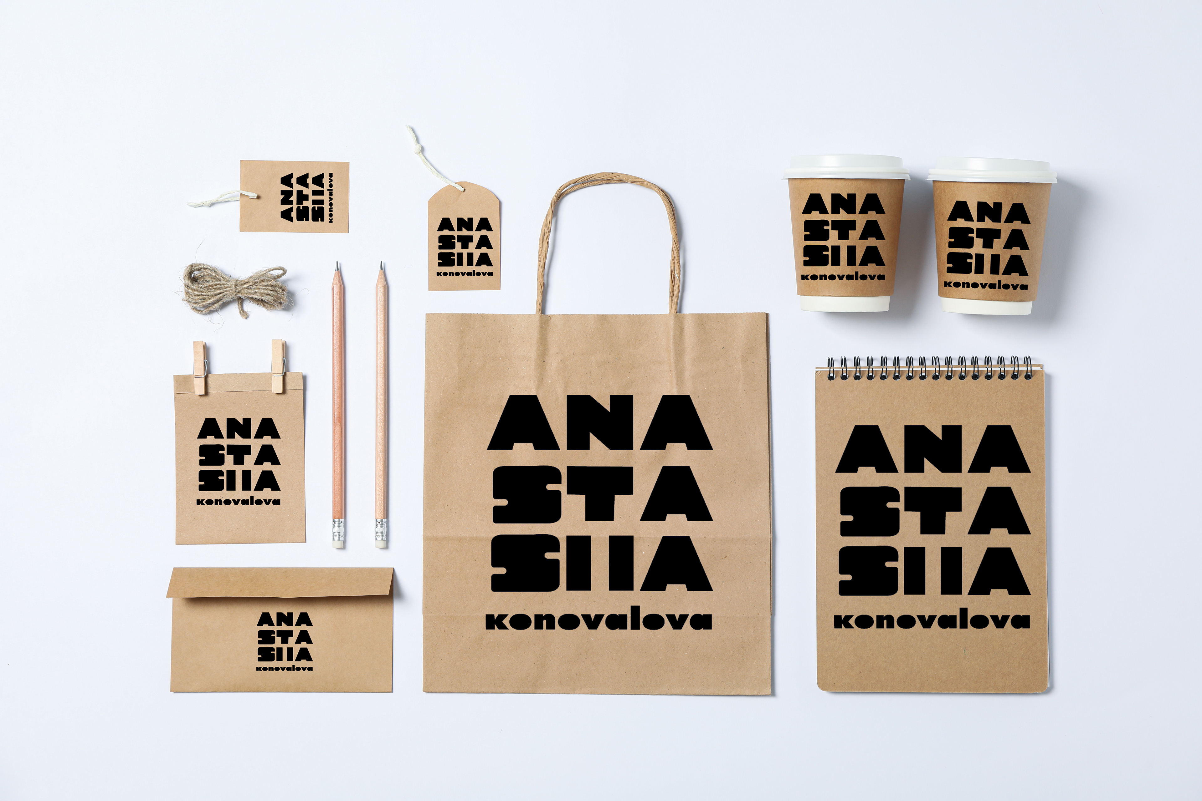
Project 3, the word mark. The assignment was about creating a wordmark design for the following classmate. The person I was partnered with was Anastasiia Konovalova, a fellow Graphic design student here at George Brown College. Creating this word mark, I wanted to embody her personality that I had learned about over the past three weeks. The first impression that you get from her is a quiet, stoic and calm personality. Due to her personal preference, I started with Futura PT. Anastasiia wanted a clean but professional look, but still bold. Which Futura PT honesty was the best choice I could have made because it gave a good, simple base with a variety of weights. Although that was only the starting point, there were multiple fonts and slight but critical adjustments to every single letter. One thing you must remember about Anastasiia is that she’s very conservative and quiet. Due to shyness and worrying about opening up to those around us. So I wanted to make it punchy because she still loves that strong and bold use of emphasis, which was shown in her Pinterest and type journal. As well as the colour, it just so happens to be one of her favourite colours.